The Rebrand from Heather Bellini Photography to BELLINI STUDIOS

Love the New Exterior? Stay Tuned for the Interior Makeover!
Why the Change?!
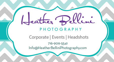
So many reasons. First of all, my previous photography branding from 2012 was SO OUTDATED and I knew it. It got to a point where handing out my cards felt cringy because the colors and style no longer represented who I am now as a photographer. I was offering branding headshots to my clients and talking about how important your brand is but I wasn’t taking my own advice!
Guess what was the coolest in the early 2010s? Turquoise & Chevron. That look doesn't fly in the 2020s! (Bad joke about how it was ‘fly’ 10 years ago).
Out with the old & In with the new!
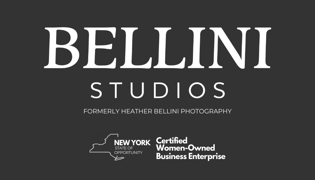
All About the Logos!
Thank you Casi Hall Creative for the beautiful new logo collection and thank you Kristen Johnson for the referral and for talking me through this difficult process - you shine like a darn diamond every single time! I am loosely taking the descriptions from Casi Hall because she said it best.
Primary Logo
My primary logo mark represents the class, sophistication, and power of the Bellini Studios brand! And although not the same, it reminds me of the font for Vogue Magazine.
Secondary Logo
My secondary logo mark is simple, punchy, and sophisticated, using an art-deco-like frame encasing the “B” from the primary logo. The sophisticated and art-deco style of the City of Buffalo was a huge inspiration for this logo!
All About the Colors!
I wanted a Sophisticated, High-end, Inviting Color Palette.
GREEN represents growth and harmony. I absolutely knew that I wanted Emerald Green no matter what. The color green can be perceived as friendy and welcoming. The Sage Green was a no-brainer since it is totally on-trend.
ROSE GOLD is often associated with style & elegance. I did not want a color that was over-top-pink so the darker Rose Gold's soft hue represents my business as being PROUDLY Woman-Owned!

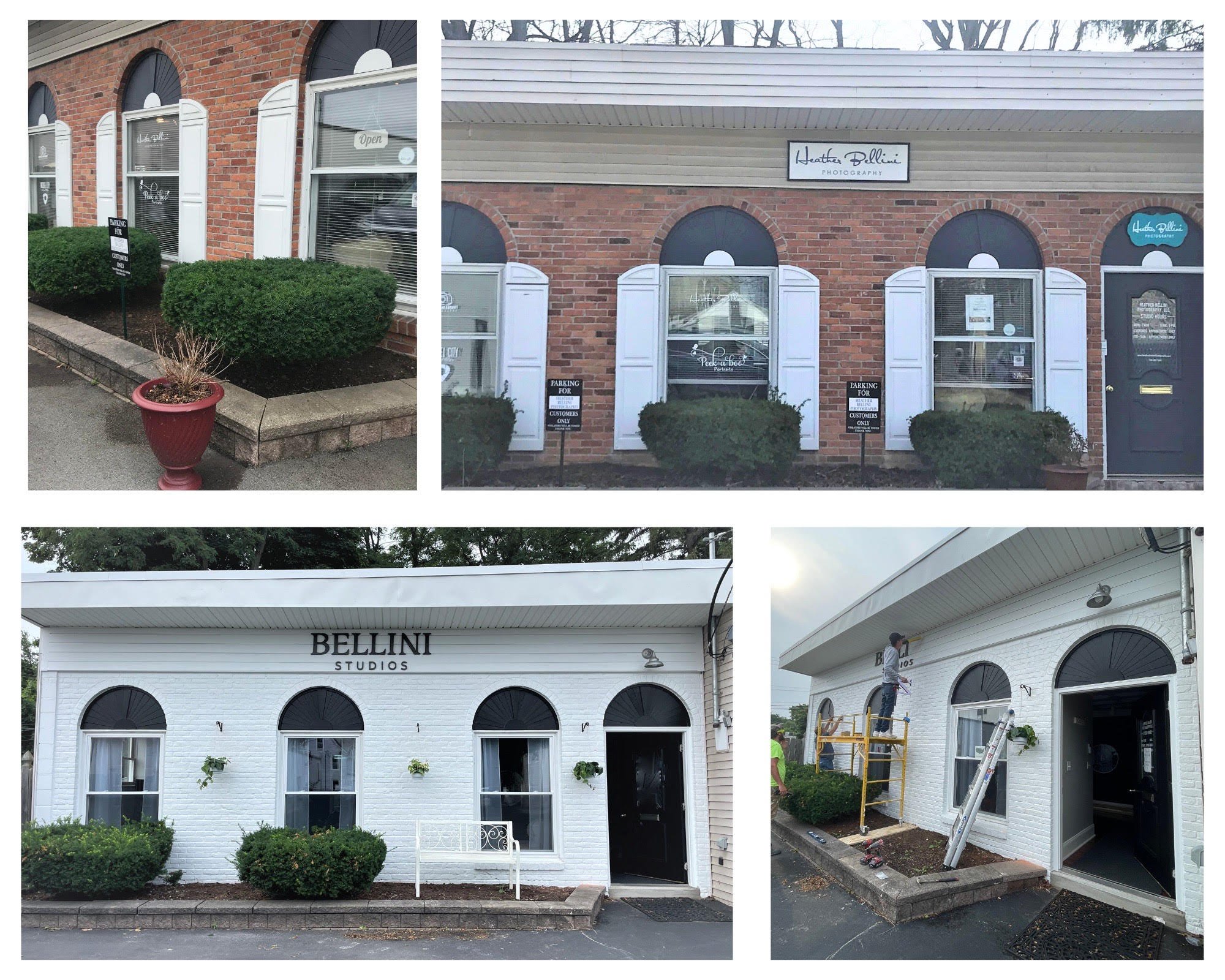
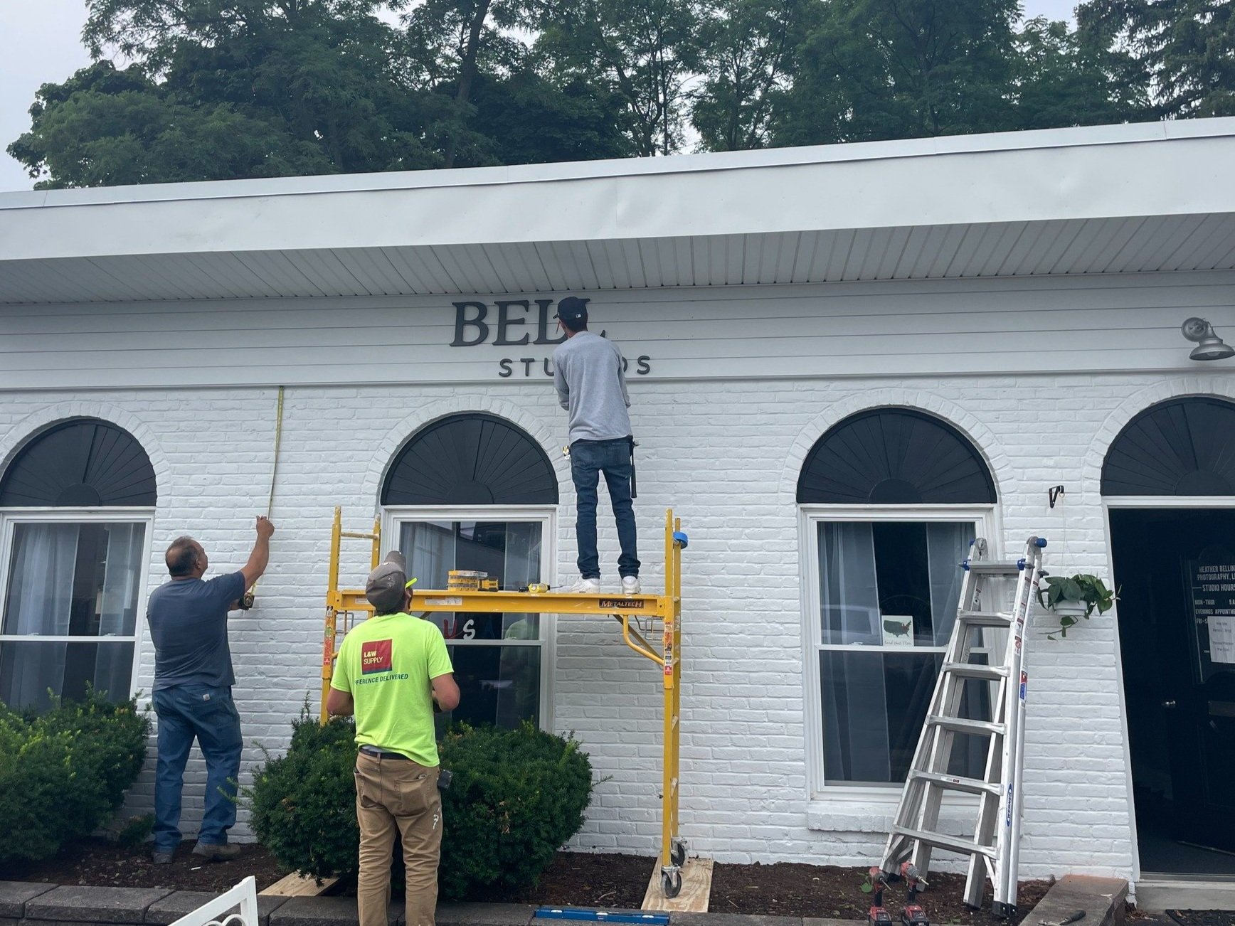
The Exterior Got a HUGE Makeover!
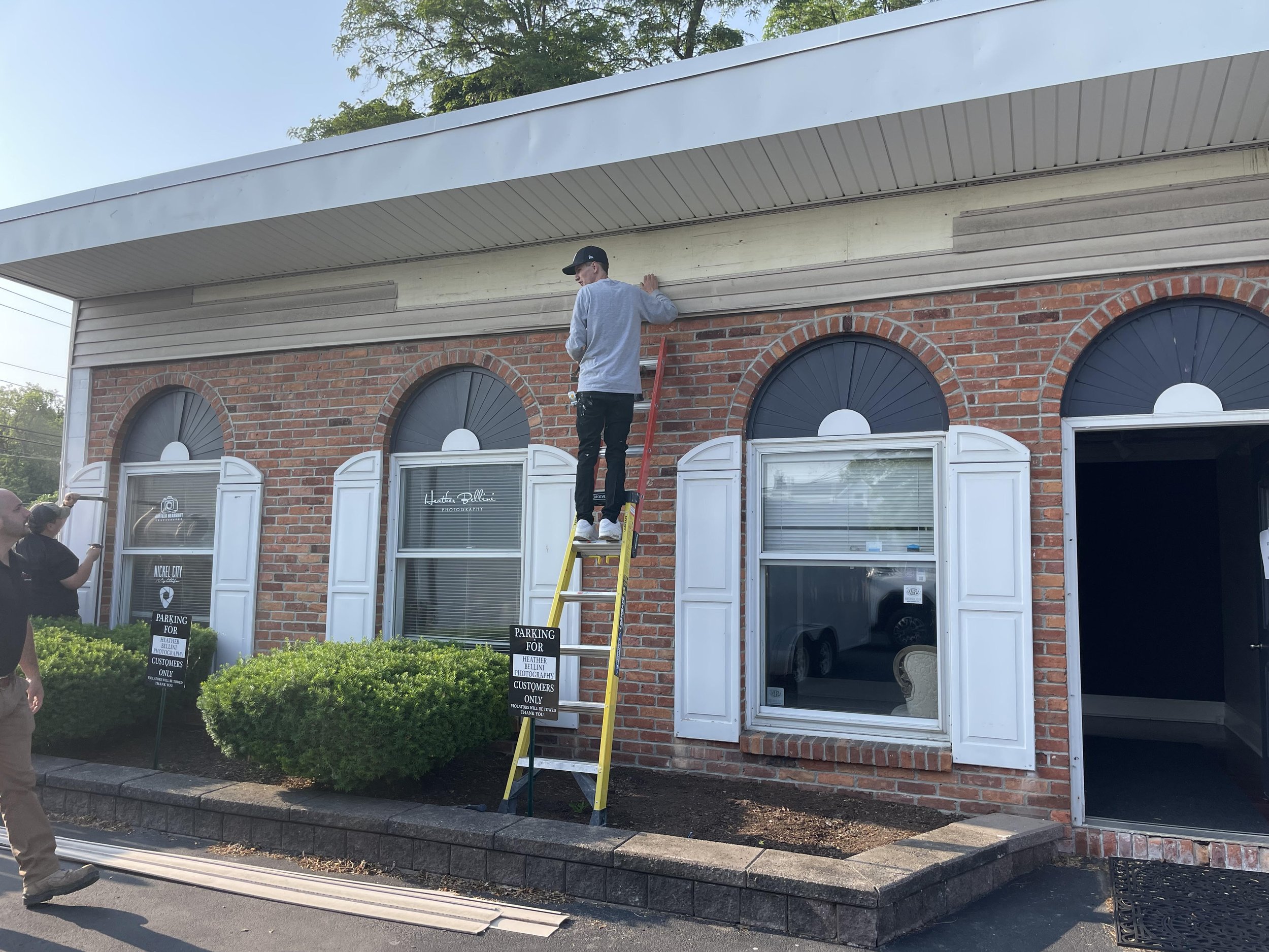
First of all, I must thank Michael Lignos, owner of MTL Contracting for the excellent work they did! I was lucky enough to be chosen for the Erie County Storefront Revision and thought it was the PERFECT time to rebrand my Williamsville Photography Studio!
The first thing that they did was rip off those shutters - that small change made a huge difference. I wanted to ‘hide’ the fan design above the window so the best choice was black for that! The front step was completely replaced and an exterior light was added above the door to which I will say FINALLY!
The modern shiplap replaced the dirty siding and my new logo was placed on top! The word that I kept saying to describe what I wanted was “clean” so white was the perfect color to tidy it up! A pop of green with the hanging plants and there you have it :)
I seriously can’t stop staring at the front of my building because it’s so pretty!
Check out the BEFORE & AFTER below!
Bellini Studios is Buffalo’s Most Trusted, Award Winning, NY STATE MWBE CERTIFIED Photography Studio, known for work in Headshots, Events & Commercial Photography.
Additionally, we have a team of specialized photographers focused on Family, Newborn & Weddings.
Bellini Studios is known for our trustworthy, high-quality, professional, and punctual work, reaching clients who know they want to work with the best. Business owners, doctors, attorneys and c-level executives hire Bellini Studios because they know they can expect quality and professionalism without having to search further.
The purpose of the Bellini Studios rebrand from Heather Bellini Photography is to make clear the level of experience, growth, and high-end professionalism clients can expect at a glance. Bellini Studios stands out from amateur competitiors and other local photographers focoused on primarily weddings.
